Pixel Art Electroman102’s Pixel Art

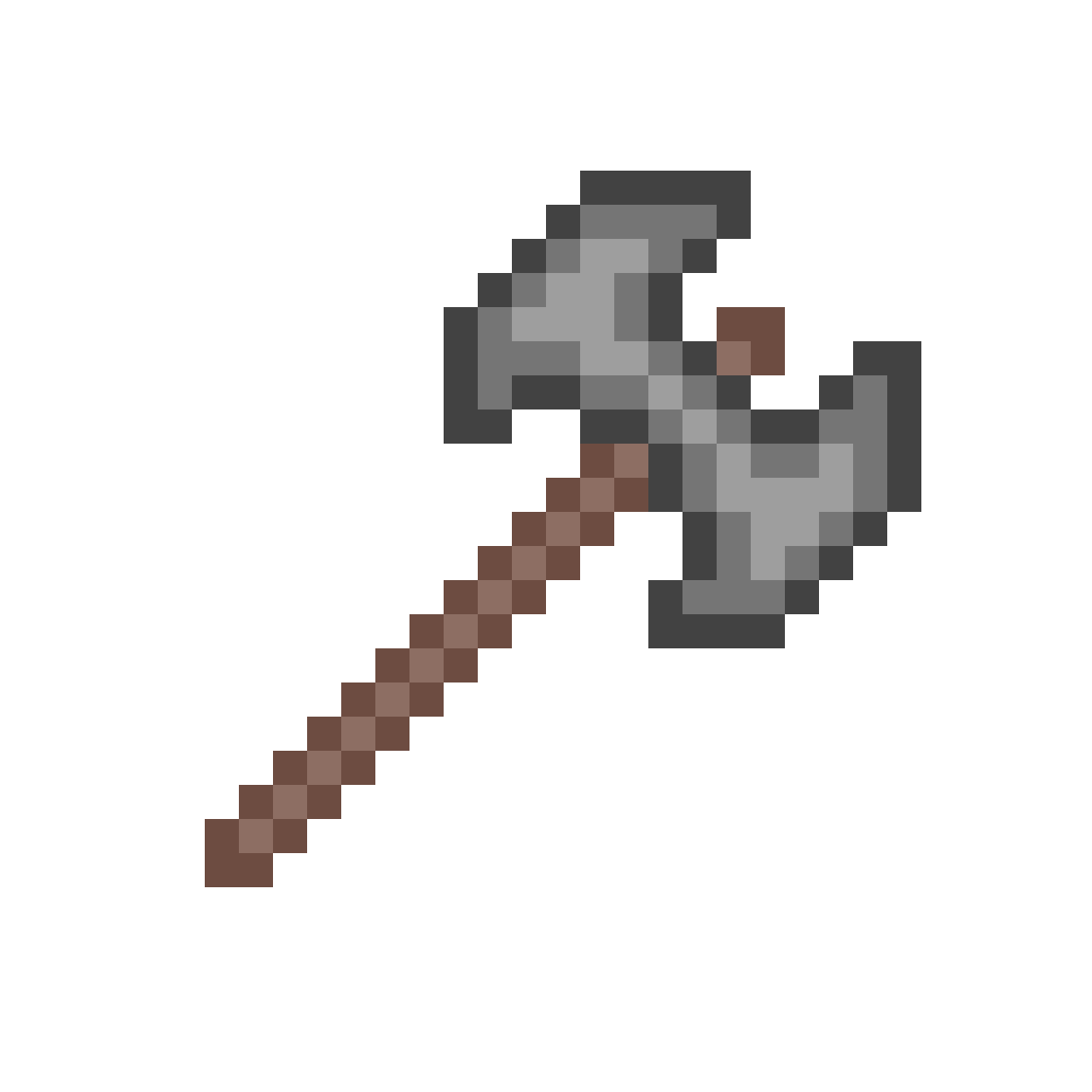
Chop chop chop!
upload_2018-8-8_21-8-4.png
 
hey Electroman, I like the design of your sprites, but I have a few tips:
  • When shading, you should have more of a contrast in your palette. Make your highlights lighter and your dark areas darker
  • Always add highlights to the side of a blade even if it completely disregads the direction of the light source
Just my two cents worth.
1. agreed
2. what, no, if it goes against the lightsource, *don't* do it. smh
3. hueshifting exists as well, not just contrast
4. and banding
5. and pillow shading
6. and bad shape
7. etc
 
1. agreed
2. what, no, if it goes against the lightsource, *don't* do it. smh
3. hueshifting exists as well, not just contrast
4. and banding
5. and pillow shading
6. and bad shape
7. etc

Gigavoir posted this once, but have a look at this and also have a look at related videos!

Sometimes it pays off not to do symmetrical shading if the light source is from a certain angle!

Oh, and from my experience and scrutiny of the Terraria sprites from the Wiki, always, ALWAYS, have 3-4 tones for the handle of the tool, where it gets brighter towards the middle or upper middle.

Also, keep dithering in mind.

Finally, to explain some of @Darkpuppey's vocab: In case you couldn't find any good explanations, I got some visual guides! Once you master these you'll be unstoppable!

Banding.png
Pillowshading.png
 
Last edited:
Back
Top Bottom