Sprites Just a little thing i thought of

ariraribari

Steampunker
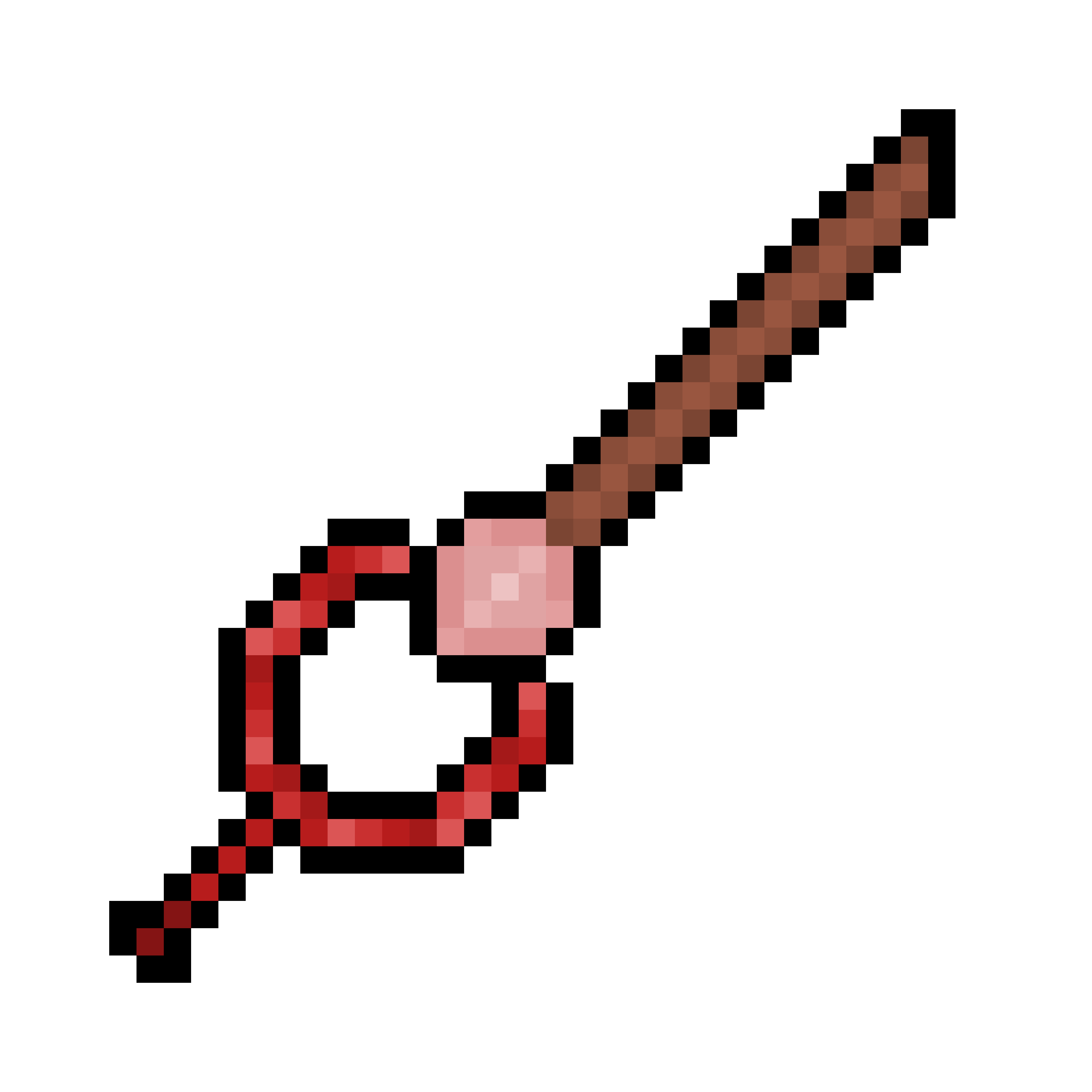
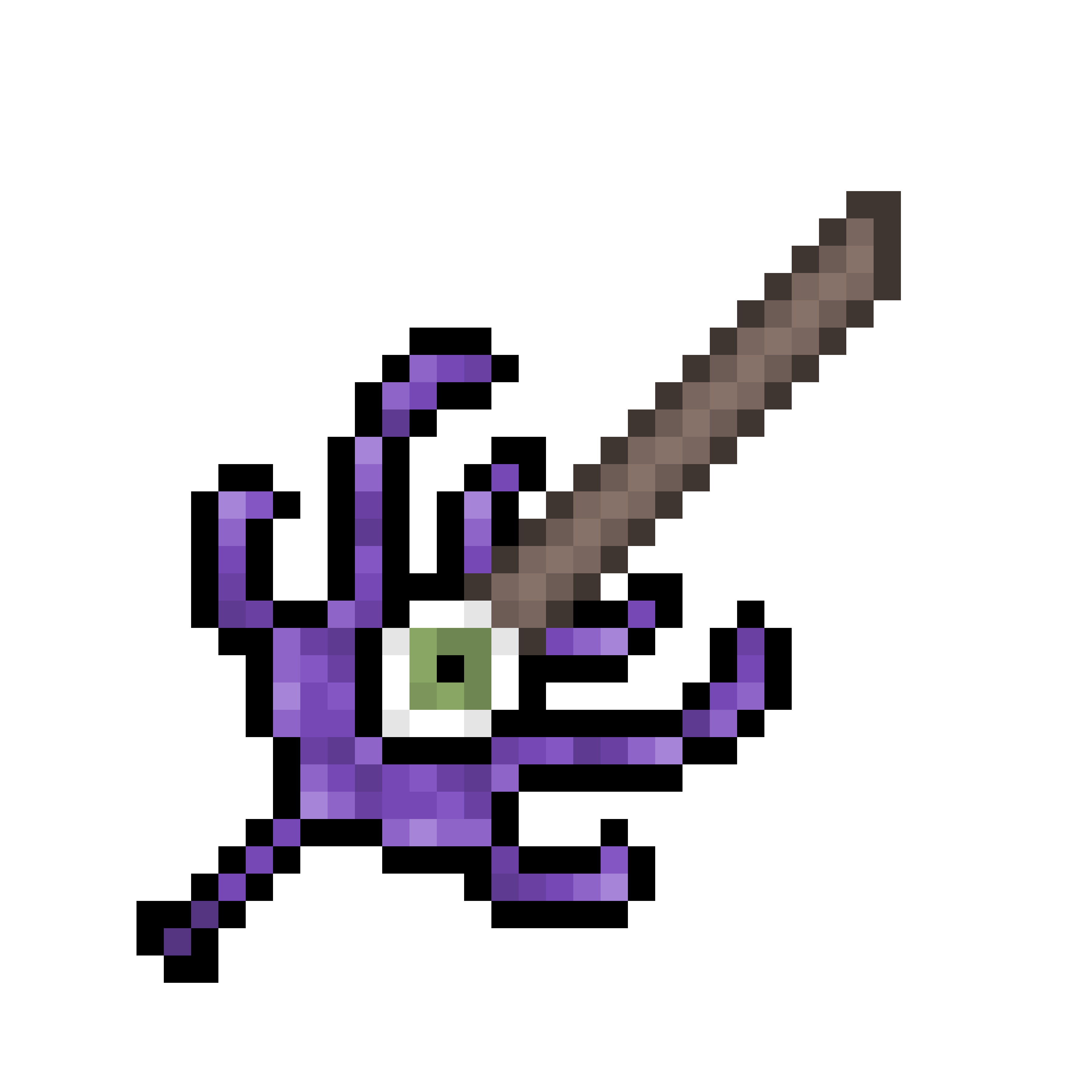
I was just making sprites, ‘cause why not? And I realized I made a sword for corruption and crimson. So I thought I‘d just show ‘em off. (These are for my Aberration mod)
1FDDF4EB-DDDE-49B7-9C7F-231C8288DB94.png
Corruption Blade
FF227004-10C9-49F8-9050-BC78C7C4269B.png
Crimson Blade
Honestly, I don’t think they look good. :|
 
They could use some tinkering, but the base idea isn't bad.

The corrupt one feels like the blade itself is a bit short in comparison to that corrupt thing adorning it, so it feels like it's a bit impractical like this, would make more sense with a longer blade.

As for the crimson one, I actually though at first that the circle is the handle, and IMO, that actually might could make it more unique.
 
I was just making sprites, ‘cause why not? And I realized I made a sword for corruption and crimson. So I thought I‘d just show ‘em off. (These are for my Aberration mod)
View attachment 318237Corruption Blade
View attachment 318238Crimson Blade
Honestly, I don’t think they look good. :|
for the top one, it is too thin and also it looks strange because the handle is so large compared to the blade. Both of the blades look a bit bland. The corruption sword's handle uses a lot of shades of purple that don't need to be there. Unless you are really good at spriting, it's best to keep your color count down. Finally, it looks like you are using pure black outlines. Use a dark version of a color instead.
 
I love the idea of the Corruption Blade’s design. You could make the blade longer though, and add a darker shade of purple.
As for Crimson, it looks a little bland. Try to add more designs.
 
They could use some tinkering, but the base idea isn't bad.

The corrupt one feels like the blade itself is a bit short in comparison to that corrupt thing adorning it, so it feels like it's a bit impractical like this, would make more sense with a longer blade.

As for the crimson one, I actually though at first that the circle is the handle, and IMO, that actually might could make it more unique.
D9F77DCF-4794-4726-BBAF-F28893859F79.png

does this look better?
 
Yes, it does, I think that you're putting too much emphasis on the shape due to the black borders, maybe soften them up.
 
Back
Top Bottom