You are using an out of date browser. It may not display this or other websites correctly.
You should upgrade or use an alternative browser.
You should upgrade or use an alternative browser.
Pixel Art Terraria Spriting Carnival 2
- Thread starter DerpoTheMagnificent
- Start date
drain.
Terrarian
Guy, it really seems terraria style didn't fit your art style, holy jesus thats amazing.
Ok, so I want to show my recent project that I'm making for a guy that requested me on discord a toxic hellhound, here's the progress
View attachment 136590
Criticism on the small toxic liquid on the ground if you can help me out with that, @drain. would you be so generous to come here?")
tbh its been a super long time since the last time i've ever done pixel art but ill try anyways
It reads to me like goop, rather than liquid, because the feet being almost perpendicular give the impression that the "liquid" has form and is upright. This can be fixed by raising the leg up a bit. Raising the leg, you do need to tweak more things, like the perspective of the spine, head and thighs, but that's relatively easy.
Also, I'm not a fan of dithering for the sake of dithering. I use dithering to add texture or ease transitions in color if there are restrictions and there's too much contrast between the two shade. Dithering here is not needed because it does not add texture nor does it ease the transition between the colors because the colors don't really have that much contrast.

Frous
The Destroyer
Thank you for the criticism, but I didn't use the dithering to add texture at all, I used because i wanted to reduce the highlights on the body, so it doesn't feels as it was skin, as that wasn't my objective here, though I stull wanted it to look like it reflected a good amount of light.tbh its been a super long time since the last time i've ever done pixel art but ill try anyways
It reads to me like goop, rather than liquid, because the feet being almost perpendicular give the impression that the "liquid" has form and is upright. This can be fixed by raising the leg up a bit. Raising the leg, you do need to tweak more things, like the perspective of the spine, head and thighs, but that's relatively easy.
View attachment 136757
Also, I'm not a fan of dithering for the sake of dithering. I use dithering to add texture or ease transitions in color if there are restrictions and there's too much contrast between the two shade. Dithering here is not needed because it does not add texture nor does it ease the transition between the colors because the colors don't really have that much contrast.
Eli10293
Spazmatism
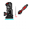
Any tips on shading metals?Guis I did a sword/spear type weapon!
View attachment 136882
Frous
The Destroyer
High contrast, big highlight area and a bit of reflection, also, connect on steam pls.Any tips on shading metals?
Frous
The Destroyer
Add a few more highlightsSmall Practice Sprite
View attachment 136883
drain.
Terrarian
Any tips on shading metals?
Metals are highly reflective and will mirror any surface you put it on.

I remember making this study a few months ago. It basically goes shine > base color > shadow > base color. It's bright, become dark, then becomes bright again.
Eli10293
Spazmatism
So basically I should put dark colors near bright colors to give a feel of the reflectiveness of metals?Metals are highly reflective and will mirror any surface you put it on.
I remember making this study a few months ago. It basically goes shine > base color > shadow > base color. It's bright, become dark, then becomes bright again.
Frous
The Destroyer
Some good stuff @Coldshot Boostar and I made:

The small thingies are the same scene but each their on version, my sprites are on the ledt, and Boostar's are on the right, enjoy
The small thingies are the same scene but each their on version, my sprites are on the ledt, and Boostar's are on the right, enjoy
dhirodndndkwlsnen
Terrarian
2 years late, but it's based on the Palladium Sword