Drawings & Paintings Terra Magicio's Art Compilation

Would like me to draw some more?

  • Yes!

    Votes: 0 0.0%
  • Not particularly... :/

    Votes: 0 0.0%

  • Total voters
    0

Terra Magicio

Wall of Flesh
Good Day! Over the past few years, I would complete some fan art here and there, but it was never organized into one thread. So, I'm going to make that thread this one. The other day, I showed you all my Plantera.
IMG_2078.PNG But, today I'm going to show you my Duke Fishron.
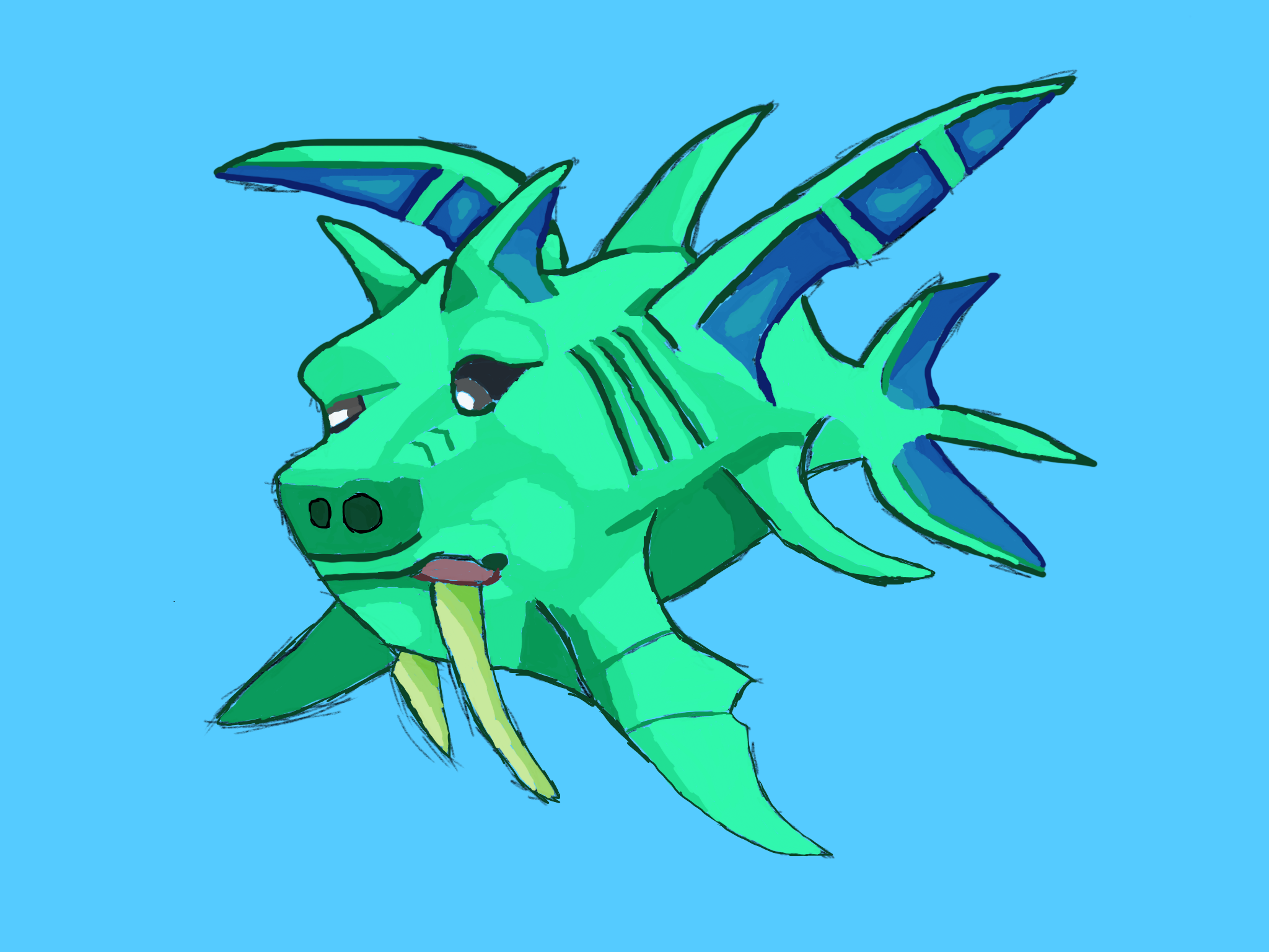
IMG_2086.PNG


As always, tell me what you think. Was it good? Was it bad? I'd like to know.
Be on the lookout for futher art by me on this page.
Have a wonderful day,
-Terram :guidesmile:
 
It's looking not bad so far. But I can suggest you to look a bit more into anatomy. The body parts of Duke Fishron looks all a bit misplaced. :guidetongue: that's the most notable thing that I saw right away.

Otherwise, you've done pretty well :guidesmile:
If I may make a suggestion. Try doing the Drakanian from the Solar Pillar.

I guess you can say I "porked him up a little bit."
Okay, that one was really bad. :guidetongue:

EDIT: and yes, I will try drawing that one.
 
It's nicely done, but I had by accident mixed up the names. :guidetongue:

I meaned one of these dudes:
Drakomire.png
Sorry, this was my fault.

However, I've to say that the drakanian looks pretty neat. maybe the shading is a little too much based on the pixel shading, to note that out.

I guess I'll give that one a go as well.

As for increasing the resolution on the Drakanian, I did have a hard time as pixel to general area is not 100% when it comes to the shape, as the original is blockier than my curved representation.
Thanks for your feedback! :guidesmile:
It's no problem, I have tons of fun on these projects.
 
It's nicely done, but I had by accident mixed up the names. :guidetongue:

I meaned one of these dudes:
Drakomire.png
Sorry, this was my fault.

However, I've to say that the drakanian looks pretty neat. maybe the shading is a little too much based on the pixel shading, to note that out.

Sorry It's been a while, but I finally found enough time to finish the guy.
Here:
IMG_0448.JPG
 
Back
Top Bottom